

- Judith Akatugba
- 0 Comments
- 920 Views
I am asked a lot about the alleged “secrets” of my photographic process. Since I think that information should be shared, I am revealing some of the key points that I always think about when I’m creating.
Read Also: Runways & Parties: London Fashion Week Celebrate 40 years
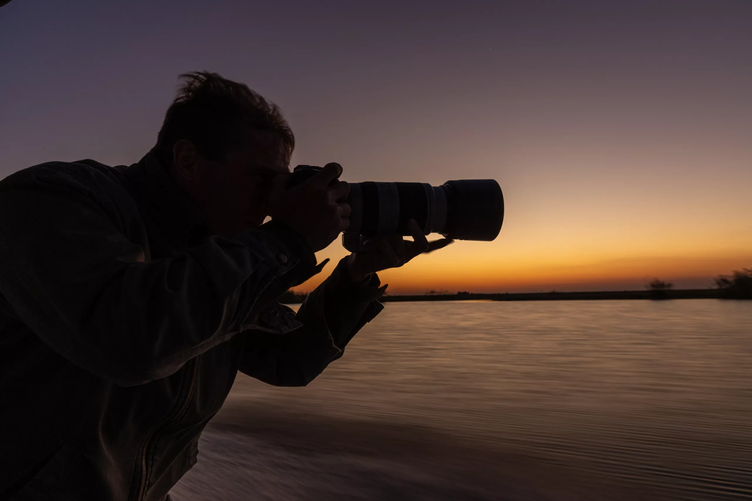
1. Gear, Motivation, and Imagination
I don’t intend to imply that you need the finest camera and lens available. How many beautiful pictures taken with outdated or inexpensive equipment do we view every day? It’s better to know your equipment very well than to not have a 100 megapixel sensor. What is the location of the dials? What and how do they act out? How can I adjust them to get the greatest performance possible? Which area of my lens is its sweet spot? Having knowledge of these kinds of things makes me feel more at ease and self-assured when I shoot. How many times have you lost an opportunity because the lens cap was on, the ISO was set too high, the camera was turned off, or you took too long to rapidly switch to a different mode? All of this has undoubtedly happened to us.
At employment, motivation is a major factor. Even though we all have moments when we lose it, we must always manage to gather our belongings, muster the courage to go somewhere, and write pixels on our cards. Things that are artistic, like music, people, books, or movies, can inspire you to take pictures.
I’ve always had a terrible time with imagination. Although a lot of my friends find this funny or assume I’m joking, the truth is that I don’t think very creatively. Maybe it’s my attitude, maybe it’s because I started taking photos in my late forties, but I’ve never been good at using my imagination. How can I locate it? There is no specific formula, which is the secret. Either you has imagination or you don’t. I still make an effort to take and process as many pictures as I can in the hopes that they will spark an idea or two in my mind.
I always take a seat with a notebook and jot down concepts that I might one day integrate into a single image in order to dig into this deeper.
2. Framing the Scene
Setting the scene is crucial, particularly if you’re filming it on site. The way you notice and capture the moment that your viewfinder (or the back display) has framed is crucial, even if many would argue that this one is rather obvious. There’s an additional dimension when looking through your viewfinder. Your camera’s sensor, lens angle, height, and many other settings can cause your framing to differ from what your eyes can actually perceive. The best technique to observe and identify a situation is to glance via the viewfinder’s generated square. It conjures up an image in our minds and directs our own vision to a specific reality.
This is a really motivating and hard occasion. It gives you the freedom to investigate and determine what matters most to you in your shot. Therefore, analyzing the moment is the first step. Ascertain your motivation for capturing a specific scene.
You still have a lot of options for making stunning compositions, even though this essay isn’t about composition rules. The Rule of Thirds is the most often used of all. I frequently utilize other guidelines, such as Leading Lines and Depth, in my own work. When used separately or in combination, these strategies frequently result in a fantastic method to put together a scenario. For example, you must use a range of scales in your composition if you wish to provide depth to a scene. You’ll need to use proportions to create a sense of varying scales between the background and foreground for this to work. The light is another essential element that you should use to improve your scene.
These are not scary tips. I promise you, you’ll be astonished at how much they improve your job.
3. Maintain Simplicity

The most crucial guideline that I constantly strive to follow is simplicity. It can just come down to personal preference. Images that have a lot going on don’t pique my interest. They could divert the eye of the spectator, making it challenging to comprehend the image’s intended meaning.
Almost automatically, our brain determines whether or not the image is pleasurable. You only have a brief window of time—roughly ten to fifteen seconds—when sharing or showcasing your shot to capture the interest of the audience. You gain more time by establishing a straightforward mood that your audience can identify with. After that, the person looking at your picture might begin to relate to it. For me, there’s no greater compliment than hearing from someone, “I can’t stop looking at your picture.”
In my work, I never employ more than three subjects or components. Anything more than that puts you on a path toward distraction. Adding negative space, or an empty space, to your photograph allows the subject to take center stage and emphasizes their primary function. Therefore, an image will contain fewer parts in its frame the larger it is. It is the rule of inverse proportionality.
The same rationale ought to be used with regard to color. Subtle variations in color and a straightforward color scheme are preferable to a wide variety of coloring. Once more, your image’s shadows and brightest area are subject to the simplicity principle. The topic ought to be able to be seen clearly above the other components in the frame.
4. The Appearance of Color on Different Devices and Color Harmony
I have to learn the hard way about color schemes and how accurate our screens are. My prior computer screen was wrong, which I recently discovered thanks to my present PC for image editing. To discover a better experience, there are a lot of products available on the market. There’s still nothing like a well calibrated, powerful monitor. And you ought to do this fantastic step much more if you print your own photos.
However, there is an additional secret that you ought to be aware of. I always see my photos at different sizes on two or three different devices. There are two reasons I do this. Initially, to obtain a preview of what the audience will see on their televisions. Secondly, to observe the quality of a picture at a reduced size. A picture has promise if it captures my attention on my phone right away.
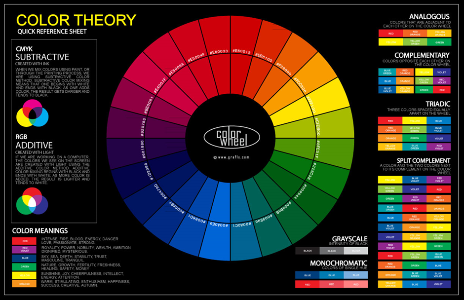
You also need to locate Color Harmony. It’s difficult to find and capture the most aesthetically pleasing color combination. There are numerous theories regarding this topic. While some advocate exclusively for the use of complementary or opposing colors, others support the use of analogous colors, which are the closest on the color wheel. The first ones are aesthetically beautiful and are typically seen in nature. In my work, I usually take the opposite approach when I want something to be very noticeable. In addition, I use additional color schemes such split complementary, triad, rectangle, and square. Every one of them is founded on forms found in the color wheel. You may find many of websites that will assist you in completing this task correctly.
5. How to Give Meaning to Your Image. Plus, How to Add a Title and Description
This is for those of us who enjoy posting pictures online and hope that many people will view our work. Our intention is to evoke strong feelings in our audience. Show off your very best efforts. I don’t mean to only display images that have the best clarity, sharpness, and technique possible. What good is having the ideal photo if those are the only things that count and it has no deeper significance?
Rather of simply taking a picture of someone because they are attractive, how about working with them to create a visual narrative? A deeper significance can be added to your photo by including an item or a first-person viewpoint. A photograph with some negative space in the composition will immediately resonate with the viewer. They may feel intimacy and emotion as a result of this. So experiment with lighting from various angles and try photographing at various distances from your subject. You’ll be shocked at how drastically an image can be altered by a single shadow.
The topic of titling photos is highly contentious. Some photographers believe that by providing an initial interpretation of an image, it misleads the spectator and restricts the viewing experience. A friend of mine once said, “A photo should speak for itself,” meaning that it doesn’t require a caption or description. A title might divert readers’ attention. Here is why I disagree with all of it, though. I don’t post many pictures to photo sharing sites like 500px. I only share one picture each week since I only take a small number of pictures and I only want to showcase my best work. Therefore, each and every image I provide is the product of numerous exchanges that I must explain to my readers and followers. Everything about these scenarios, from a quote I penned to a movie I saw to a song I heard to an experience I had on location, is specific to me. I think the person who picked your picture out of millions of others should be awarded with a special caption or piece of information about the picture.
I have the same thoughts when it comes to captioning a picture. I take a lot of time in search of the ideal title that would pique the interest of a potential audience. A title could also spark a controversy or discussion. I responded to a comment made on my photo “Nothing Left to Lose” stating that I truly meant something different from what was implied by the title, as it was such a lovely picture.


